


Jonathan Saunders London 2015 Resort Collection
Jonathan Saunders London 2015 Resort Collection
Source: Jonathan Saunders London Collection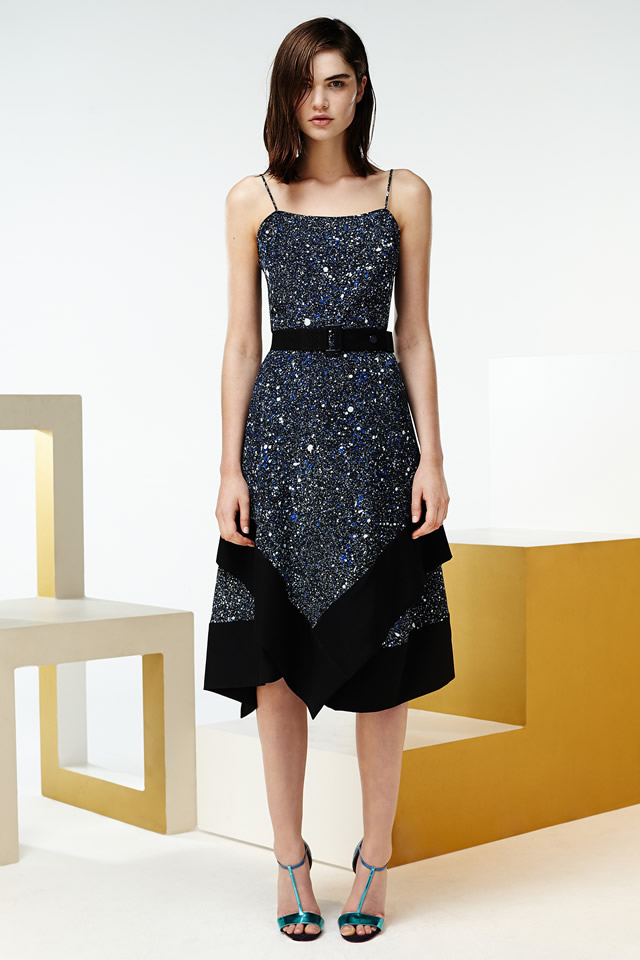
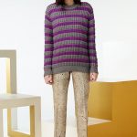
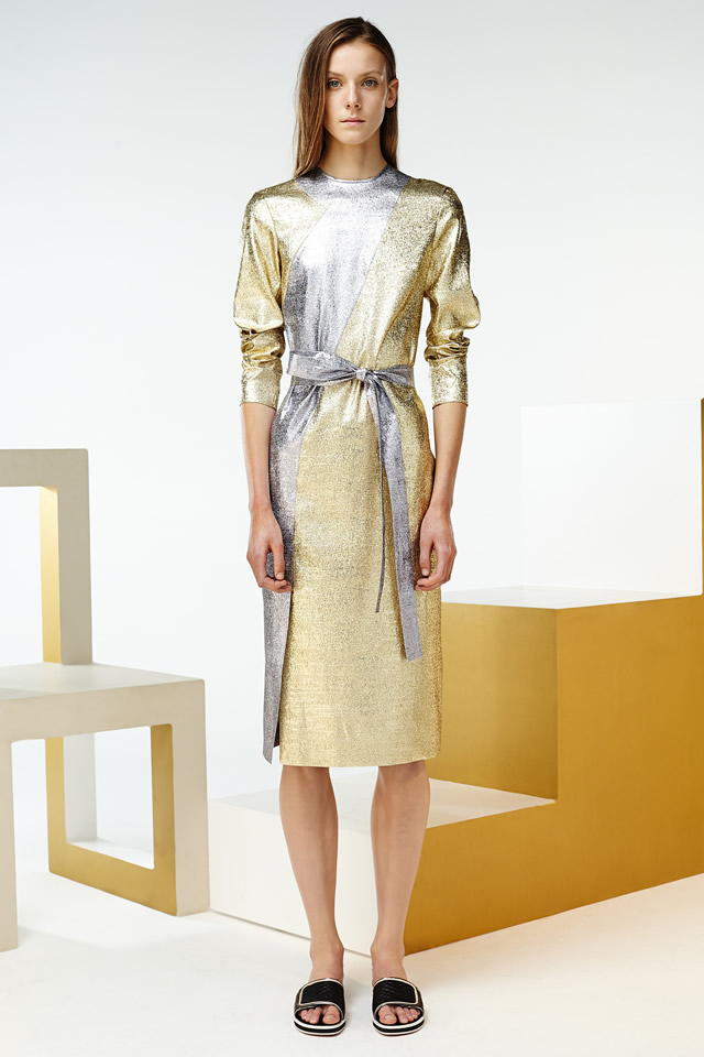
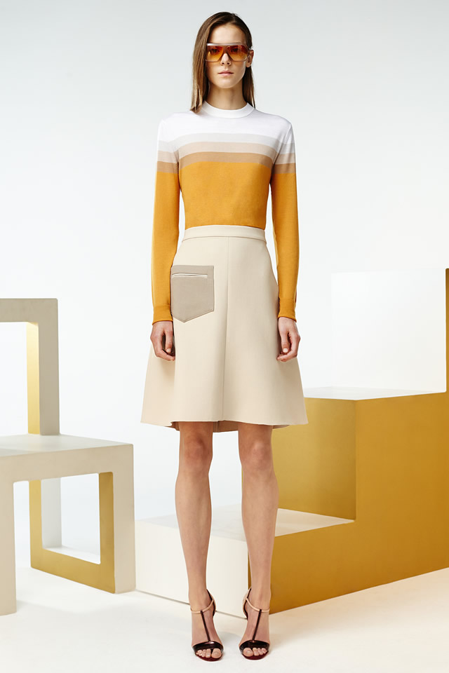
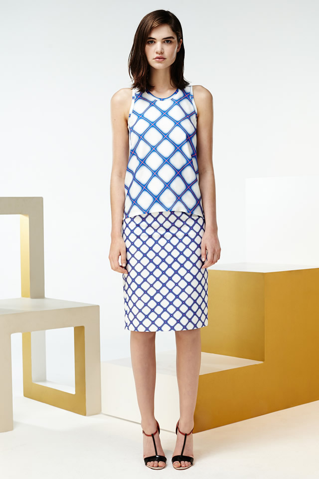
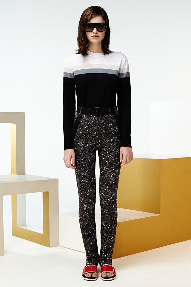
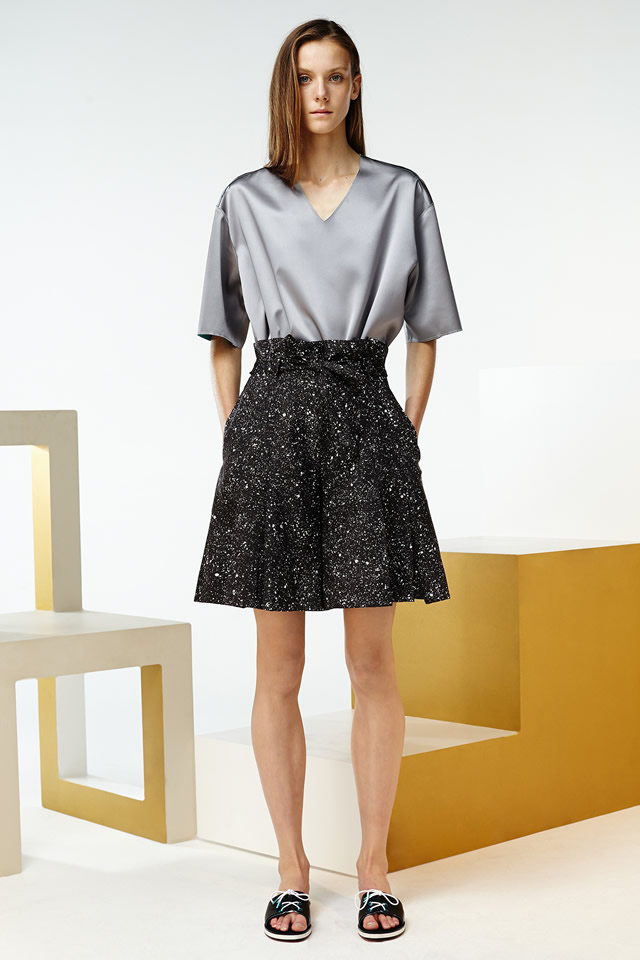
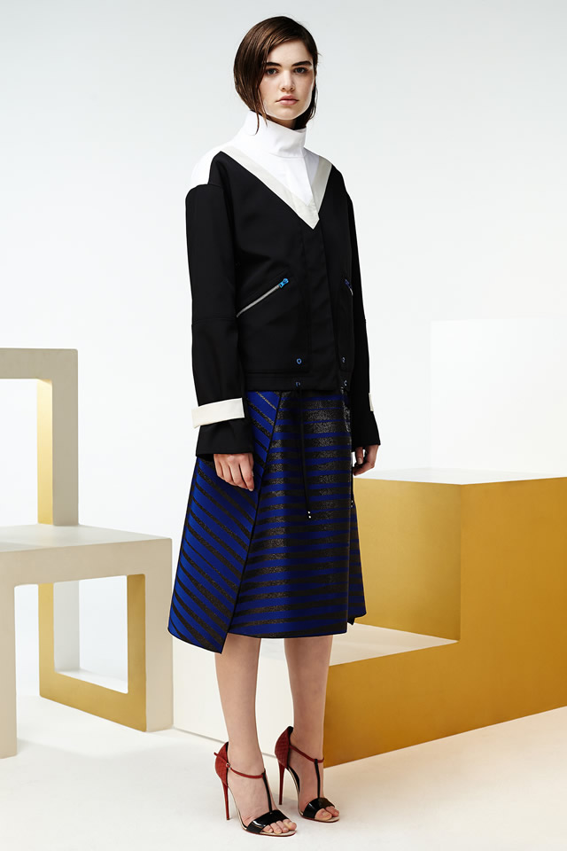
Saunders new collection mirrored the lavish mood of the hyper-sophisticated world. His intonations were brashly luxe, gold, bronze and silver, remarkable in a Lurex lamé skirt and broken pattern used is lamé bonded on fabric
"I do my best when I’m working on two projects in unison," said Jonathan Saunders while he was prepping the presentation of his Resort collection and his menswear for Spring 2015. "And there’s always been such a great relationship between these two collections that I thought, Why not show them together?" It’s true that in the past, Johnny’s guys and his Resort girls have always made a dream team, but there was a special something about his latest pairing, maybe because it looked so grown-up.
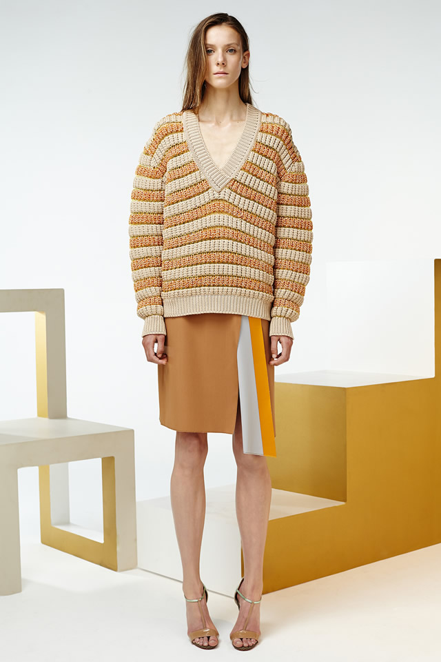
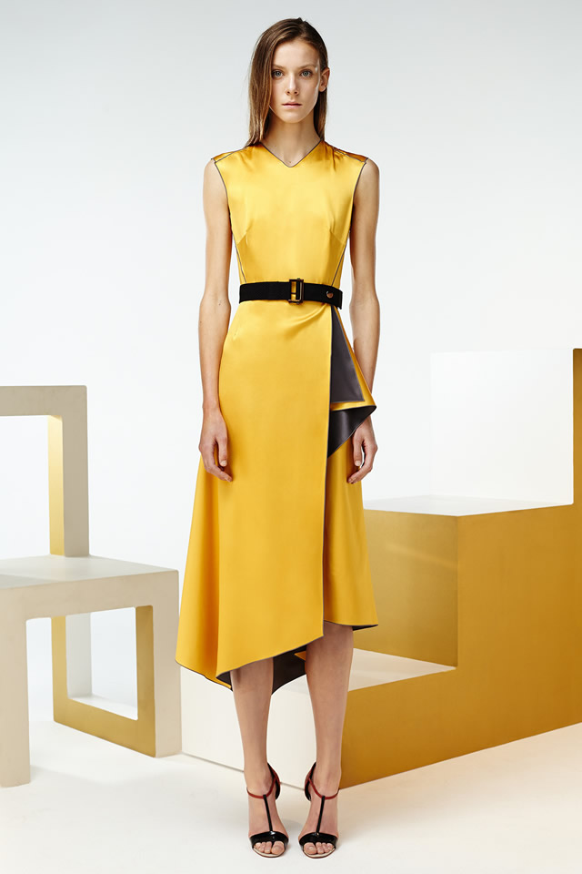
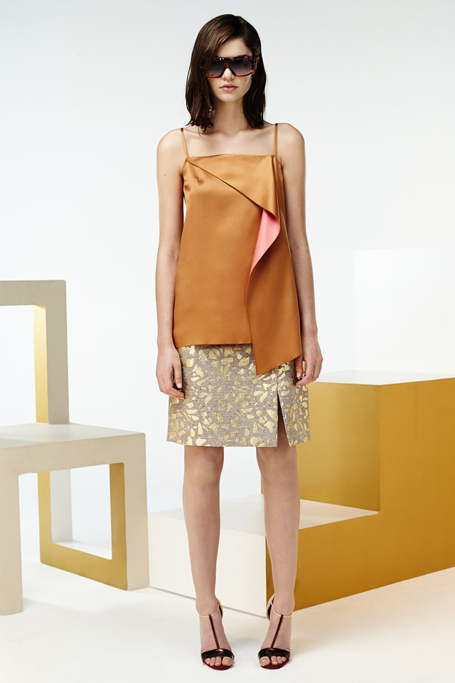
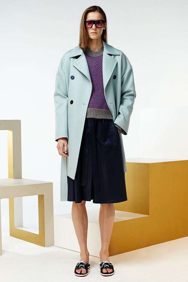
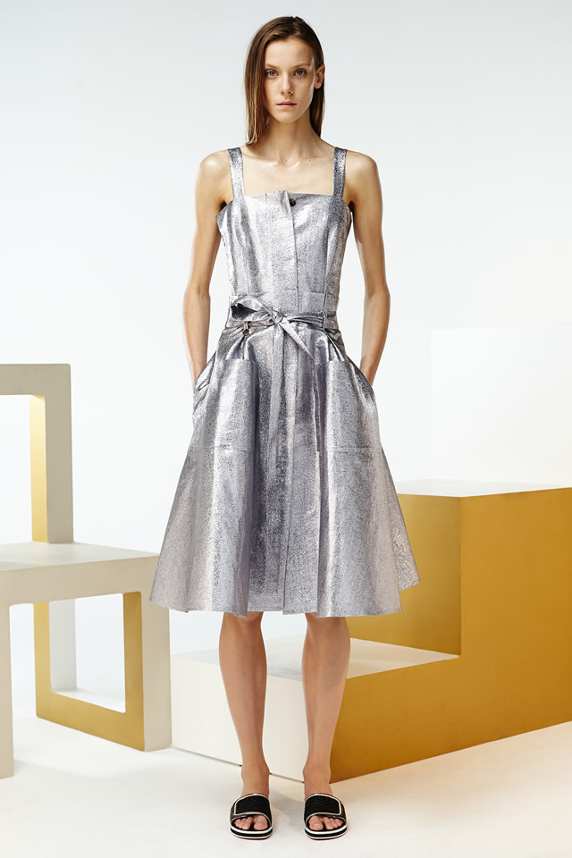
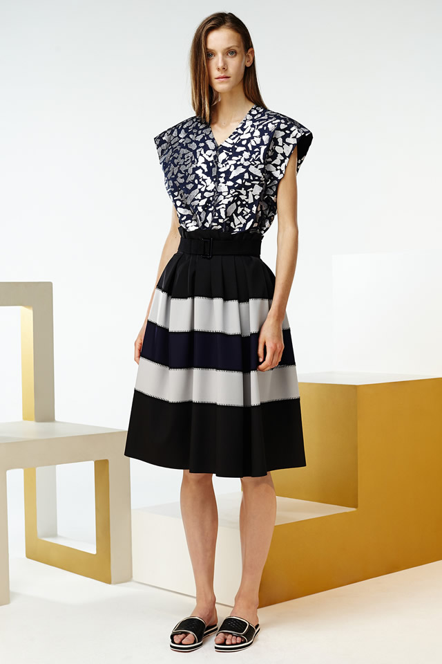
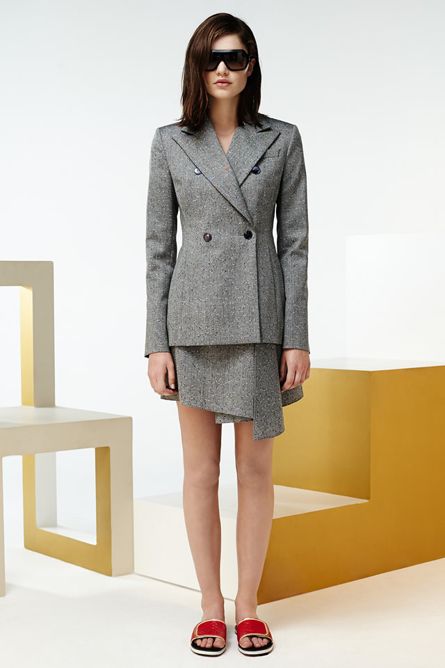
That had a lot to do with what Saunders was thinking about while he was creating. He studied furniture design back in Glasgow, and someone with his graphic sensibility was inevitably drawn to Ettore Sottsass, figurehead of the epochal Memphis movement and, before that, Alchimia. Saunders‘ new collections reflected the lush mood of the hyper-sophisticated world pictured by Italian design magazines like Domus and Casa Vogue in the seventies. His accents were brashly luxe, gold, bronze and silver, spectacular in a Lurex lamé skirt, more subtle in the foil stripes screen-printed on a cotton tee, or the broken pattern used throughout that looked like a print but was actually lamé bonded on fabric.
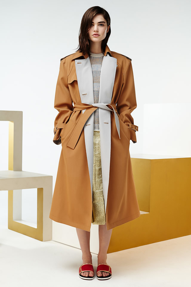
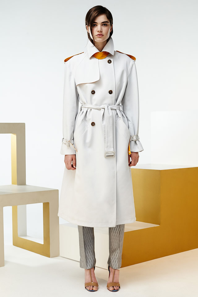
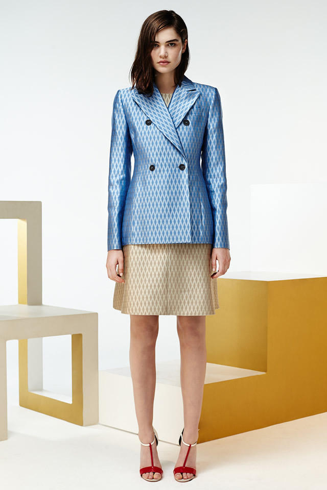
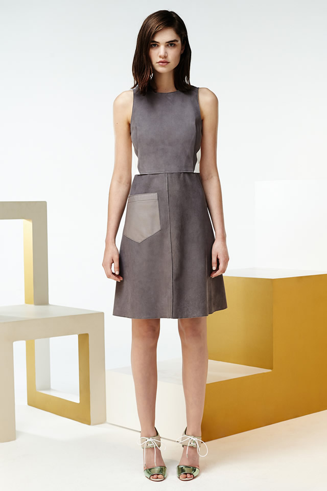
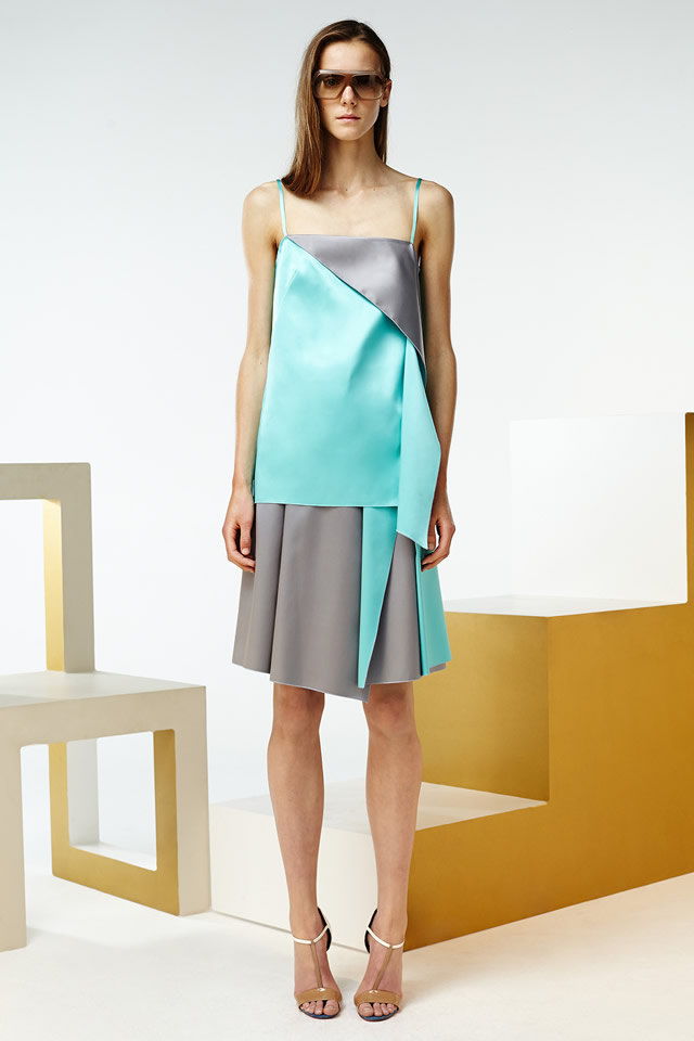
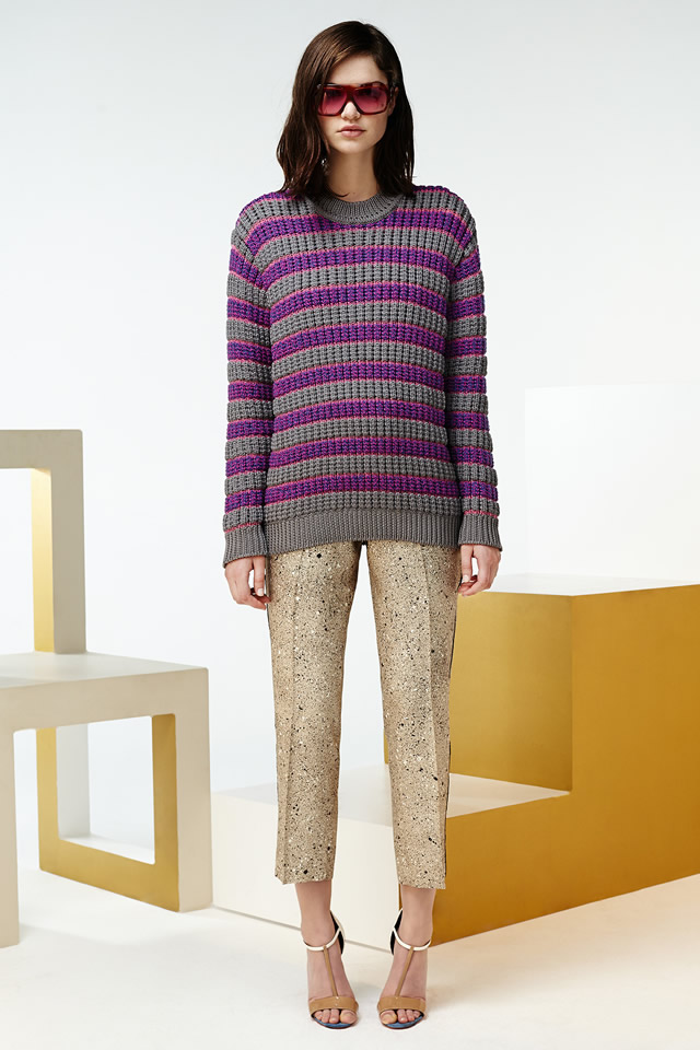
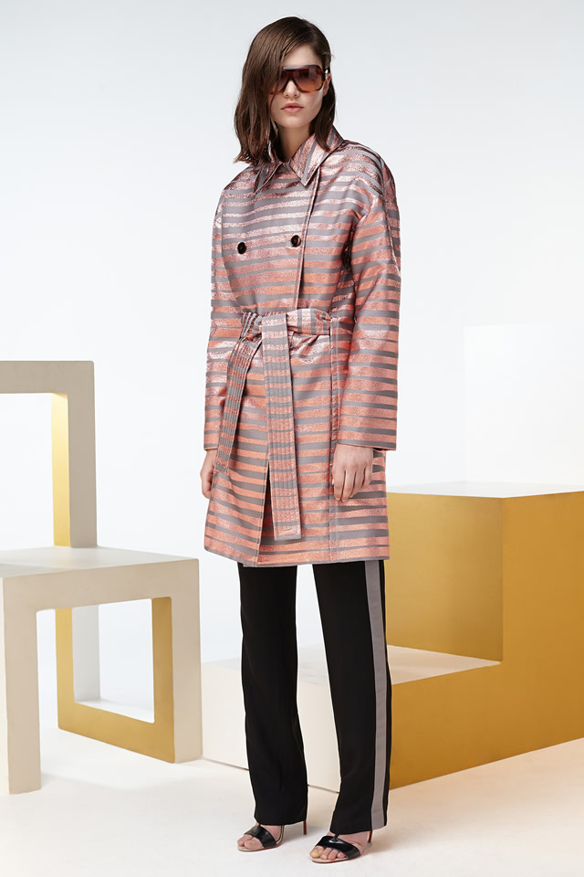
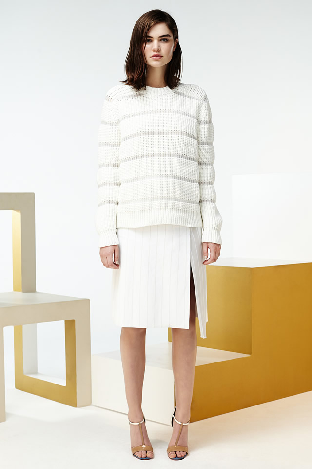
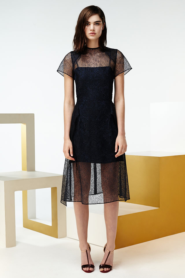
Saunders made his name with engineered prints, so he has always had the ability to trick the eye. As he’s grown, those tricks have become so subtle as to pass without mention, and yet they are still real feats of fabric technology. One singular effect here was the way he integrated mesh yarn into his knitwear, to create a springy lightness. The pleasure Saunders once took from print is now matched by his appreciation of texture. "Joy in decoration," he called it. The stripes on a coat were actually stitched together, like Frankenstein’s monster. And there was an element of surprise in the clothes, like a bonded satin tunic that flipped up to reveal a flash of deep turquoise.
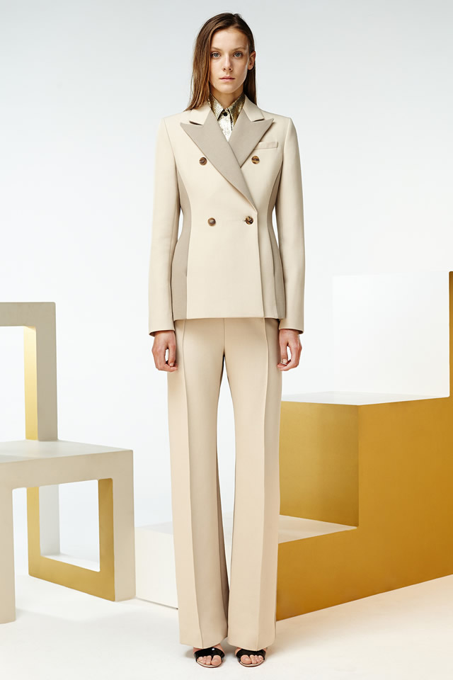
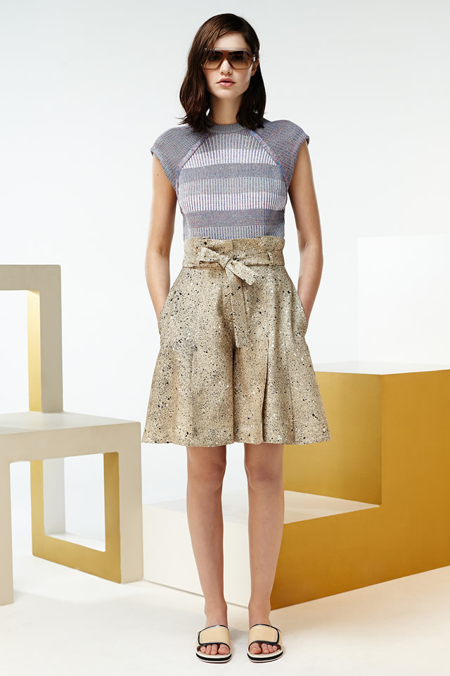
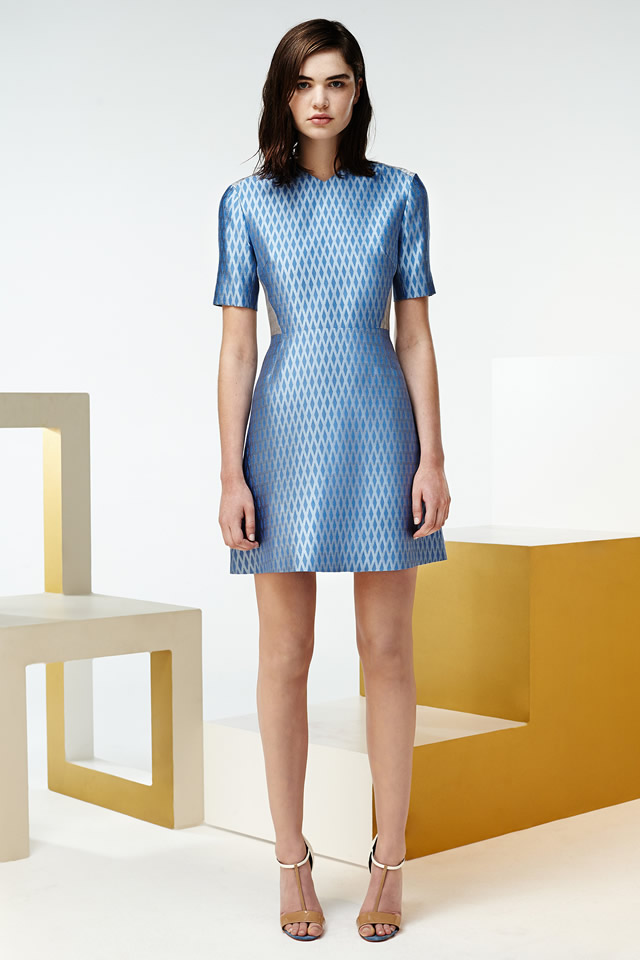
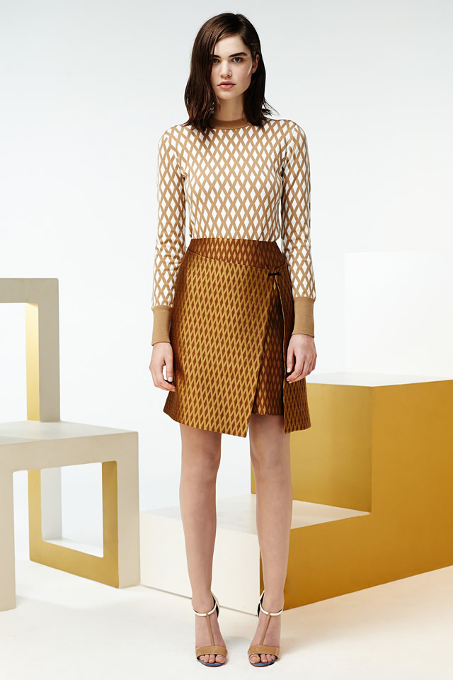
The caramel-y confidence of Saunders‘ new work had a distinctly bourgeois feel. Whenever he turned his attention to the indiscreet charms of the bourgeoisie in the past, he ended up with sly takes on the overly medicated or the swinging sexaholic or the plain unhinged. These collections were much more straightforward, more commercial. But there were a few knowing reminders of Saunders‘ taste for tack, among them the pool-slides that Natalie Westling wore with her gold skirt, and the spatter pattern that was the dominant visual element in both women’s and menswear. It looked like grand star maps, but it was actually borrowed from cheap Formica floor tiles. Sottsass himself couldn’t have pulled off a better alchemy.